 本站 - 自定义样式模块原创
笔记
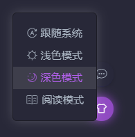
如果你喜欢加粗的 绿色、`` 包裹的 英文高亮 abcd、<mark></mark> 包裹的 文字高亮、深色模式的各种颜色(点击右下角的衣服图标,切换深色模式)等等,那么可以参考下面的文章。
2022-01-01 @Young Kbt
# 前言
本模块已经提取 Vdoing 主题常用的元素选择器,并写好了注释,方便阅读。
你如果不满意我的颜色样式,想改成自己喜欢的颜色,直接在提取的元素选择器提供 Color 即可。
如果你细心观察,你就会发现本站的一些样式和主题自带的样式有所区别。
在浅色主题,也就是默认主题下,我修改了一些内容:
- 代码块背景色
- 代码块行数颜色
- 代码高亮背景色
- 代码高亮颜色
- 加粗颜色
......
在深色主题下,我修改了一些内容:
- 代码块背景色
- 代码块行数颜色
- 代码高亮背景色
- 代码高亮颜色
- 加粗颜色
- 页面背景色
- 导航栏颜色
- 侧边栏颜色
- 表格背景色
- 表格偶数行颜色
......
如果你喜欢我的一些样式,可以参考下面的代码。
又或者你想定制自己的样式,也可以修改颜色,基本的选择器都已经写好了,只需要更改颜色即可。
# 样式代码
打开 docs 目录下的 .vuepress 目录下的 style 目录下的 palette.styl 文件,添加如下内容:
//***vdoing主题-样式变量***//

// 以下注释的变量仅供参考,主题使用的最新变量请查看:https://github.com/xugaoyi/vuepress-theme-vdoing/blob/master/theme-vdoing/styles/palette.styl
// 你可以在这个文件内修改这些变量的值

// 主题调色板

// 原主题预设变量
// 颜色
// $accentColor = #3eaf7c
// $textColor = #2c3e50
// $borderColor = #eaecef
// $codeBgColor = #282c34
// $arrowBgColor = #ccc
// $badgeTipColor = #42b983
// $badgeWarningColor = darken(#ffe564, 35%)
// $badgeErrorColor = #DA5961
// 布局
// $navbarHeight = 3.6rem
// $sidebarWidth = 20rem
// $contentWidth = 740px
// $homePageWidth = 960px
// 代码块
// $lineNumbersWrapperWidth = 3.5rem


//***vdoing主题-变量***//

// 颜色

$bannerTextColor = #fff // 首页 banner 区(博客标题)文本颜色
$accentColor = #11A8CD
$activeColor = #ff5722
$arrowBgColor = #ccc
$badgeTipColor = #42b983
$badgeWarningColor = darken(#ffe564, 35%)
$badgeErrorColor = #DA5961

// 布局
$navbarHeight = 3.6rem
$sidebarWidth = 18rem
$contentWidth = 860px
$homePageWidth = 1100px
$rightMenuWidth = 230px // 右侧菜单

// 代码块
$lineNumbersWrapperWidth = 2.5rem

// Young Kbt
// 代码块的行数字颜色
div[class*="language-"]
  &.line-numbers-mode
    .line-numbers-wrapper
      color #9e9e9e

// 加粗字体颜色
strong
  // color
  color #00A55A

.suggestions
  max-height 800 px
  overflow-y scroll
.suggestions .highlight
  color #64acff
  font-weight bold

.footer {
  color: #fff;
}

// 解决目录页和标题冲突问题,新版已经解决,这里是旧版的j(2022-4-16)
// .theme-vdoing-content:not(.custom) > h1,
// .theme-vdoing-content:not(.custom) > h2,
// .theme-vdoing-content:not(.custom) > h3,
// .theme-vdoing-content:not(.custom) > h4,
// .theme-vdoing-content:not(.custom) > h5,
// .theme-vdoing-content:not(.custom) > h6 {
//  margin-top: -1.1rem;
//  padding-top: 2.6rem;
// }

.theme-mode-light
  --bodyBg: #f4f4f4
  --mainBg: rgba(255,255,255,1)
  --sidebarBg: rgba(255,255,255,.8)
  --blurBg: rgba(255,255,255,.9)
  --customBlockBg: #fff
  --textColor: #00323c
  --textLightenColor: #d63200     // `` 高亮,原来是 #0085AD
  --borderColor: rgba(0,0,0,.15)
  // 代码块浅色主题
  //--codeBg: #f6f8fa
  //--codeColor: #24292e
  //codeThemeLight()
  // 行高亮颜色,和代码块浅色主题一起使用,一起注释
  //div[class*="language-"]
  //  .highlight-lines
  //    .highlighted
  //      background-color rgba(200,200,200,.4)
  //  &.line-numbers-mode
  //    .highlight-lines .highlighted
  //      &:before
  //        background-color rgba(200,200,200,.4)
  // 代码块深色主题
  --codeBg: #282C34
  --codeColor: #D4D4D4
  codeThemeDark()
  // 行高亮颜色,和代码块深色主题一起使用,一起注释
  div[class*="language-"]
    .highlight-lines
      .highlighted
        background-color rgba(0,0,0,.66)
    &.line-numbers-mode
      .highlight-lines .highlighted
        &:before
          background-color rgba(0,0,0,.66)
  div[class*="language-"].line-numbers-mode::after  // 代码块的行数和内容分割线颜色
    border-right 1px solid rgba(0, 0, 0, 0.66)
   // 下面代码块深色和浅色通用
   // `` 包裹的背景色
  .theme-vdoing-content
    code
      background-color #fff5f5
      //background-color transparent
  // 引用的颜色
  blockquote
    background-color #fdefee
    border-left .25rem solid #e95f59
    padding 10px 16px
    opacity .9
  // 选中代码块的颜色
  pre[class*="language-"]::selection, pre[class*="language-"] ::selection,
  code[class*="language-"]::selection, code[class*="language-"] ::selection {
    text-shadow none
    background-color #0A62C9
  }
  // mark 标签配置
  mark
    color #d63200
    border .1em solid #d63200
    background-color transparent
    padding .1rem .5rem
    border-radius 2rem
    margin 0 .2rem
    font-size .95rem
  // ::: details 的边框
  .custom-block.details
    border solid 1px #ddd

// 深色模式
.theme-mode-dark
  --bodyBg: rgba(40,40,56,1)
  --mainBg: rgba(40,40,56,1)
  --sidebarBg: rgba(40,40,56,.8)
  --blurBg: rgba(40,40,56,.9)
  --customBlockBg: rgba(25,25,49,0.53)
  --textColor: #acb7c4
  --textLightenColor: #b160ea   // `` 包裹的文字颜色
  --borderColor: #1d1d26
  --codeBg: #1d1d26
  --codeColor: #A9B7C6
  codeThemeDark()
  div[class*="language-"].line-numbers-mode::after  // 代码块的行数和内容分割线颜色
    border-right 1px solid rgba(0, 0, 0, 0.66)
  // `` 包裹的背景色
  .theme-vdoing-content
    code
      background-color transparent
  // 引用的颜色
  blockquote
    background-color rgba(25, 25, 49, 0.53)
    border-left .25rem solid #904ac2
    padding 10px 16px
  // 首页每一个模块的边框
  .card-box
    border-radius: 5px;
    background var(--mainBg);
    box-shadow 0 2px 10px 0 rgba(0,0,0,.20);
    transition box-shadow 0.5s;
  .card-box:hover
    box-shadow 2px 2px 15px 2px rgba(0,0,0,.40);
  // mark 标签配置
  mark
    color #b160ea
    border .1em solid #b160ea
    background-color transparent
    padding .1rem .5rem
    border-radius 2rem
    margin 0 .2rem
    font-size .95rem
  // 表格的样式
  table
    border-color #1d1d26
    thead
      background-color #2c2c47
      font-size 1.02rem
  tr:nth-child(2n)
    background-color #2c2c47
  // 信息框容器颜色
  .custom-block.tip,
  .custom-block.warning,
  .custom-block.danger,
  .custom-block.note
    background-color rgba(25,25,49,0.53)
  .custom-block.danger
    color #ff4545
    .custom-block-title
      color #ff4545
  .custom-block.note
    color #28a1de
  // 鼠标悬停、a 标签颜色,主题默认颜色 #11a8cd
  .nav-item > a:not(.external):hover,
  .nav-item > a:not(.external).router-link-active,
  .nav-item .dropdown-title a:hover,    // 导航栏悬停
  .nav-item .dropdown-title a.router-link-active,
  .dropdown-wrapper .dropdown-title .title:hover    // 导航栏非 a 标签
    border-bottom 2px solid #b160ea

  a.sidebar-link.active     // 侧边栏当前标题
    color #b160ea
    border-left-color #b160ea

  .post-list .post .title-wrapper a:hover,   // 首页文章列表悬停
  .blogger-wrapper .icons a:hover,     // 首页头像下的图标悬停
  .categories-wrapper .categories a:not(.active):hover,   // 文章分类悬停
  .pagination span:hover,       // 首页的上一页和下一页悬停
  a.sidebar-link:hover,   // 侧边栏悬停
  .right-menu-wrapper .right-menu-content .right-menu-item.active a,  // 文章右侧当前标题
  .right-menu-wrapper .right-menu-content .right-menu-item a:hover,   // 文章右侧标题悬停
  .dropdown-wrapper .nav-dropdown .dropdown-item a:hover,   // 导航栏的二级导航悬停
  .dropdown-wrapper .nav-dropdown .dropdown-item a.router-link-active,   // 导航栏的选中二级导航
  .buttons .button .select-box li.active,    // 当前主题模式
  .buttons .button .select-box li:hover,      // 三个主题模式悬停
  .archives-page .theme-vdoing-wrapper li a:hover,   // 归档列表悬停
  .search-box .suggestions .focused a:hover,   // 搜索框内容鼠标悬停
  .custom-block.details summary:hover     // ::: details 的标题悬停
    color #b160ea

  .categories-wrapper .categories a:not(.active):hover,   // 文章分类悬停
  .right-menu-wrapper .right-menu-content .right-menu-item.active,
  .search-box input:focus   // 搜索框获取焦点
    border-color #b160ea

  .buttons .button:hover      // 右下角三个图标
    background #904ac2
    box-shadow 0 0 15px #904ac2
  .pagination .pagination-list span.active,     // 分页的当前页
  .search-box .suggestions .parent-page-title   // 搜索框的标题
    background #904ac2

  // vuepress-plugin-tabs 插件的背景色
  .tabs-component-tab,
  .tabs-component-panels
    background-color rgba(25,25,49,0.53)
    border none
  // vuepress-plugin-tabs 插件的标题选中颜色
  .tabs-component-tab.is-active
    color #b160ea

// 阅读模式
.theme-mode-read
  --bodyBg: rgb(236,236,204)
  --mainBg: rgba(245,245,213,1)
  --sidebarBg: rgba(245,245,213,.8)
  --blurBg: rgba(245,245,213,.9)
  --customBlockBg: rgb(236,236,204)
  --textColor: #704214
  --textLightenColor: #996633
  --borderColor: rgba(0,0,0,.15)
  --codeBg: #282c34
  --codeColor: #fff
  codeThemeDark()
1
2
3
4
5
6
7
8
9
10
11
12
13
14
15
16
17
18
19
20
21
22
23
24
25
26
27
28
29
30
31
32
33
34
35
36
37
38
39
40
41
42
43
44
45
46
47
48
49
50
51
52
53
54
55
56
57
58
59
60
61
62
63
64
65
66
67
68
69
70
71
72
73
74
75
76
77
78
79
80
81
82
83
84
85
86
87
88
89
90
91
92
93
94
95
96
97
98
99
100
101
102
103
104
105
106
107
108
109
110
111
112
113
114
115
116
117
118
119
120
121
122
123
124
125
126
127
128
129
130
131
132
133
134
135
136
137
138
139
140
141
142
143
144
145
146
147
148
149
150
151
152
153
154
155
156
157
158
159
160
161
162
163
164
165
166
167
168
169
170
171
172
173
174
175
176
177
178
179
180
181
182
183
184
185
186
187
188
189
190
191
192
193
194
195
196
197
198
199
200
201
202
203
204
205
206
207
208
209
210
211
212
213
214
215
216
217
218
219
220
221
222
223
224
225
226
227
228
229
230
231
232
233
234
235
236
237
238
239
240
241
242
243
244
245
246
247
248
249
250
251
252
253
254
255
256
257
258
259
260
261
262
263
264
265
266
267
268
269
270
271
272
273
# 插件样式
目前本站使用了 vuepress-plugin-reading-progress 插件,该插件能显示一个页面的进度条(位于顶部的紫色进度条),下面是我用的样式(放在 palette.styl 里):
// 顶部进度条插件
 $readingBgColor = transparent
 $readingZIndex = 1000
 $readingSize = 3px
 $readingProgressColor = #b160ea
 $readingProgressImage = none
1
2
3
4
5
6
2
3
4
5
6
安装这个插件的命令:
yarn add vuepress-plugin-reading-progress
1
然后在 config.js 的 plugins 中,添加如下内容:
module.exports =[
    [
        'reading-progress'
    ]
],
1
2
3
4
5
2
3
4
5
启动后就会生效。
编辑此页 (opens new window)
更新时间: 2023/10/23, 10:58:52